mixOmics provides various graphical methods for exploring `omics data through dimension reduction. These methods visualise relationships between samples and variables to help with data interpretation.
All graphical functions are based on S3 methods, ensuring flexibility across different object types (e.g., cca, spca, plsda).
There are two types of plots:
- Sample Plots: Show similarities between samples.
- Variable Plots: Highlight variable importance and relationships.
Sample Plots
Sample Projection Plot – plotIndiv()
- Displays samples as points projected onto latent components.
- Similar samples cluster together.
- Works with all mixOmics methods.
Arrow Plot – plotArrow()
- Represents paired coordinates as arrows.
- Short arrows = strong agreement, long arrows = disagreement.
- Used in N-integration frameworks.

Variable Plots
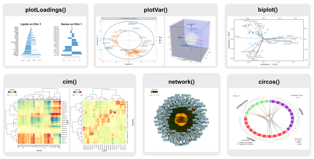
Loadings Bar Plot – plotLoadings()
- Displays variable contributions as a bar plot.
- Works with most dimension reduction methods.
Correlation Circle Plot – plotVar()
- Shows correlations between variables and components.
- Used in PCA, CCA, and PLS methods.
Biplot – biplot()
- Similar to
plotVar(), but includes sample projections. - Used in PCA and PLS.
Clustered Image Map (CIM) – cim()
- Generates heatmaps for high-dimensional data.
- Works for single omics and two-dataset integration.
Relevance Network Graph – network()
- Visualizes associations between variables from two omics datasets.
- Use for N-integration on two omics
Circos Plot – circosPlot()
- Extends CIM and relevance networks.
- Uses a circular layout for multi-dataset visualisation.
- Suitable for N-integration contexts.